
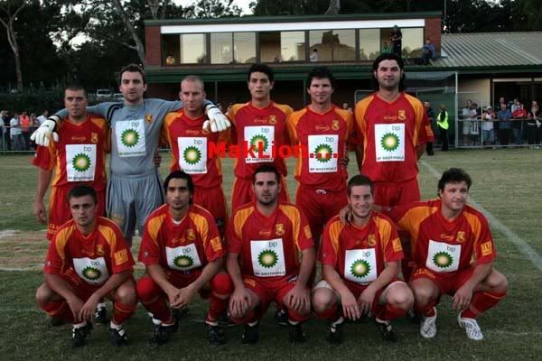
That is the South home strip for this year. I don't really like it, but the sponsor on there looks rather nice for once. And I hate it a lot less after I saw what some of the other teams had cooked up.
Speaking of sponsor/strip clashes... Preston's strip has been universally caned but on reflection, despite the abomination that is that colour combination, they could be forgiven for at least looking after the colour-blind, who most frequently have difficulty with separating red and green.

Finally for now, a clear demonstration of what works, and what just doesn't. Fawkner last year had a pretty crappy strip. How do you fuck up light blue you may ask? By putting a stupid white slab slanting down across the shoulder, making it look like you've run out of dye. So kudos to Fawkner for embracing a neo-classicist approach of sorts. As for the Knights, they had one of the better strips last year. And now they've gone for tie-die. For a club with such rampant right-wing sympathies, it strikes me as an odd tactic that they're now aiming for the hippy/stoner market. But Australian soccer (the proper version, not that mickey mouse 'a' league divorced from reality) always has something up its sleeve to at once both depress and amuse.